For the Blogging from A to Z Challenge, I’m having Fun with Fonts. Each day I’ll feature a few I like based on either the look of the font or its name. I’ll also pick a font to inspire one of my tweet tales.
When I was a wee lass, I had a Sesame Street sign language book that taught some of the basic signs, which I spent hours memorizing. As the years passed, I forgot most of what I learned, but I made sure to remember the alphabet because, even if I had to fingerspell everything, I wanted to be able to communicate if I met someone who was hard of hearing. I’ve only actually met two people so far, and since they both had hearing aids and read lips with impressive skill, I never had to break out my slow and awkward fingerspelling. Anyway, I thought it was cool that one of the F fonts is Finger Signing. In addition to showing the position of the fingers, it also has the letter in the corner, so you can easily learn the ASL alphabet from the font.

The next one just makes me laugh – it’s letters formed out of band-aids and is called First Aid. That’s what most of my first aid looks like, too: slap a bunch of band-aids on the problem and hope for the best.

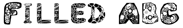
This next one has the most boring name so far:
Filled ABC. I mean, yes, it certainly describes the font, but it doesn’t capture the variety of patterns that give it visual interest. I think it would look way more awesome if it had colors, but even in black and white it reminds me of the bold patterns in Aboriginal art.
In today’s hypersensitive culture, some might be offended by the name
Fat Boy Smiles, but for me, all those happy faces do their job and make me grin. I don’t think it’s possible to be in a bad mood while typing with this font.
I was drawn to
Fair Faces because the first novel I wrote was a YA Horror set at the fair (I called it
A Fair to Remember – hee!). Although it’s been ‘drawered’ for years, I’ve recently pulled it out to see if I can salvage it. Maybe I’ll use this font for chapter headings to inspire me. But for now, I’ll use it to inspire my tweet tale, although it’s not so much a tale but a tweet synopsis of the novel.
It’s supposed to be a night of fun at the fair, but for a teen hounded by fear, the line between shrieks of joy & cries of terror is blurry.
What do you think of these fonts? Do they inspire any stories in your mind? How Fantastic is Freya with her letter F?
For the Blogging from A to Z Challenge, I’m having Fun with Fonts. Each day I’ll feature a few I like based on either the look of the font or its name. I’ll also pick a font to inspire one of my tweet tales.
When I was a wee lass, I had a Sesame Street sign language book that taught some of the basic signs, which I spent hours memorizing. As the years passed, I forgot most of what I learned, but I made sure to remember the alphabet because, even if I had to fingerspell everything, I wanted to be able to communicate if I met someone who was hard of hearing. I’ve only actually met two people so far, and since they both had hearing aids and read lips with impressive skill, I never had to break out my slow and awkward fingerspelling. Anyway, I thought it was cool that one of the F fonts is Finger Signing. In addition to showing the position of the fingers, it also has the letter in the corner, so you can easily learn the ASL alphabet from the font.
The next one just makes me laugh – it’s letters formed out of band-aids and is called First Aid. That’s what most of my first aid looks like, too: slap a bunch of band-aids on the problem and hope for the best.
This next one has the most boring name so far:
Filled ABC. I mean, yes, it certainly describes the font, but it doesn’t capture the variety of patterns that give it visual interest. I think it would look way more awesome if it had colors, but even in black and white it reminds me of the bold patterns in Aboriginal art.
In today’s hypersensitive culture, some might be offended by the name
Fat Boy Smiles, but for me, all those happy faces do their job and make me grin. I don’t think it’s possible to be in a bad mood while typing with this font.
I was drawn to
Fair Faces because the first novel I wrote was a YA Horror set at the fair (I called it
A Fair to Remember – hee!). Although it’s been ‘drawered’ for years, I’ve recently pulled it out to see if I can salvage it. Maybe I’ll use this font for chapter headings to inspire me. But for now, I’ll use it to inspire my tweet tale, although it’s not so much a tale but a tweet synopsis of the novel.
It’s supposed to be a night of fun at the fair, but for a teen hounded by fear, the line between shrieks of joy & cries of terror is blurry.
What do you think of these fonts? Do they inspire any stories in your mind? How Fantastic is Freya with her letter F?